
In his latest installment, the Math Hatter stays current with a look at a formula for classroom arrangements in the era of social distancing, false positives in Covid-19 testing, and the late, great British mathematician John Conway.
The unusually high number of calls received by the 1-800-MATHATTER hotline over the past weeks I can explain in at least two ways. First, it is only natural that, having to stay home and with plenty of time on your hands, most of you would go back to their favorite hobby: learn and do some math or binge watch that excellent 3Blue1Brown YouTube channel. These callers don’t really need help as much as some advice about books they should read or other videos worth watching. Then, there are others who sometimes struggle with the mathematical concepts mentioned in the news coverage of the pandemic: flattening the curve, false negatives or social distancing.
“Dear Math Hatter, says one student in 3e, I keep hearing about exponential growth but I’m not sure I understand what it is exactly. Can you help? Thank you.”
That one is easy, it’s been covered in a previous chronicle which is still available here.
Or take this curious CM1 wondering “Why is everyone speaking about John Conway lately?”
Well, I’m not sure about “everyone” but it is true a lot of news networks had a segment about the famous British mathematician who died of COVID-19 complications on April 11. A teacher at Cambridge and then Princeton, John H. Conway is revered among mathematicians for his many contributions to various fields such as game theory or topology. For the general public, he will mostly be remembered for the Game of Life, a game he created in 1970 which became an example of how complexity can be created from very simple elements. The game has strong connections with Turing machines and the early age of computers but its rules are really simple and it can be played with pencil and paper…and patience. If you want to give it a try, you can find the instructions here.
Let’s move on. Here is another question from a primary teacher:
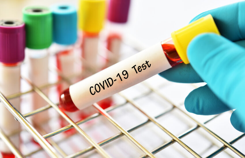
“Dear Math Hatter, I hope your zoom meetings are going well. Here is my question: I don’t understand how a test can be 90% or even 95% accurate and still give so many false positives. Thank you.”
This is an excellent question and answering it fully would require an introduction to Bayesian probabilities, a subject taught in Terminale. But here, a few examples will be enough. The first thing you need to understand is what this accuracy exactly means. For example, let’s take pregnancy tests who regularly advertise over 99% accuracy. How is that measured? It’s actually quite simple. The test is given to women we already know are pregnant and we look at how many of the tests give a positive result. If, out of 1000 pregnant women, 995 tests say they are pregnant then the lab can say the test is 99.5% accurate. The thing is, when women use a test they obviously don’t know if they are pregnant and they need to infer from a positive result that they are. This seemingly small difference is actually the crux of the matter and we shall take numbers to see why.
Let’s imagine a rare disease with a prevalence of 1 per 10,000 in the global population and let’s consider a town of 1 million inhabitants. This means that 100 persons have the disease. Now let say we have a test that is 90% accurate. Again, what it means is that if we were to test these 100 sick persons, 90 tests would give a correct result. The other 10 are called false negatives because the test says they are not sick while they actually are. This is the number we want to be the lowest possible.
Let’s also assume that the test is 90% accurate when used on a non-sick person. This is not always the case that these two measures of accuracy are the same. Because this is a rare disease we have a lot of healthy people, 999,900 out of 1,000,000. Among these, 10% or 99,990 will get an incorrect test result, meaning they will believe to be sick but are not. These are the false positives and although they seem to be a lesser danger than the false negatives, the patients concerned might, depending on the disease, start a treatment for wrong reasons. Here is a table which sums up this first situation:
| Sick people | Non-sick | Total | |
| Positive | 90 | 99,990 | 100,080 |
| Negative | 10 | 899,910 | 899,920 |
| Total | 100 | 999,900 | 1,000,000 |
Now we can look at the other side of the coin and answer the question: if I get a positive test, how do I know if I am sick (a true positive) or not (a false positive)? Well, the answer is clear here because the table shows that out of 100,080 who tested positive (90+99,990) only 90 are sick. In other words, if a test reveals a positive result there is only about 1 chance out of 1000 that the person is really sick. In a way, this is the true “accuracy” of the test and there are two reasons why this is awfully low. The first one is the fact that the disease is very rare and the second is that 90% accuracy is not that great to start with. If we change the values to have a prevalence of 1 in a 100 and an accuracy of 99% we get this new table:
| Sick people | Non-sick | Total | |
| Positive | 9,900 | 9,900 | 19,800 |
| Negative | 100 | 980,100 | 980,200 |
| Total | 10,000 | 990,000 | 1,000,000 |
This is decisively better but a person who tests positive still has only 50% chance to be sick. Flipping a coin to know if you have the disease would not make any difference. Labs know this and their game is to bet on the fact that most people will not know the difference between the odds of testing positive if they are sick (the accuracy they can announce safely) and those of being sick if they test positive.
Of course, since the coronavirus is contagious we can expect more people to be sick to the point that it cannot be considered a rare disease. Let’s use numbers from recent studies and consider an estimate that 20% of all New Yorkers actually contracted the disease. We will take a population of 10 millions to make calculations easier. With a 99% accurate test we get this new table:
| Sick people | Non-sick | Total | |
| Positive | 1,980,000 | 800,000 | 2,780,000 |
| Negative | 20,000 | 7,200,000 | 7,220,000 |
| Total | 2,000,000 | 8,000,000 | 10,000,000 |
We can see that about 70% of people who test positive actually have the disease, our best result so far. However, in that case we have 20,000 sick persons who think they are healthy and may spread the virus. How can we do better? You may have heard about the idea of “herd immunity” which says that we need at least 70% of a population to contract the disease (and recover and get some immunity) to be able to say we have controlled the pandemic. Let’s see how our numbers would look like in that situation:
| Sick people | Non-sick | Total | |
| Positive | 6,930,000 | 30,000 | 6,960,000 |
| Negative | 70,000 | 2,970,000 | 3,040,000 |
| Total | 7,000,000 | 3,000,000 | 10,000,000 |
Of course, we still have a lot of false positives but this time more than 99% of people who test positive do have the disease. There! We finally get the 99% accuracy both ways. This shouldn’t come as a surprise since so many people have the disease.
We end up with this kind of “catch 22” situation. If you have an accurate test and a lot of people are sick you will have a lot of people testing positive but you won’t know that a lot of people are sick if you don’t do the tests. That is why administrative statements of the sort “We are not like that country. We don’t need to do a lot of testing because we don’t have a lot of cases.” doesn’t make a lot of sense because the only way that country knows they have a lot of cases is because they performed a lot of tests. If you don’t open the door, you can keep the illusion that your house is not on fire, despite the increasing heat and the smoke coming from under…
The last question I will address comes from a parent: “Dear Math Hatter, Mrs Estey recently spoke of a hybrid back to school in the Fall with half classes alternating days to respect social distancing. What would be the best way to arrange tables in a classroom if one wants to fit a maximum number of students? Thank you.
That is my favorite question. The answer is not as counterintuitive as the false positives situation but it has a nice geometrical solution. Obviously, we are not talking about students waiting in line to enter the cafeteria. That problem is easy. Everyone just stands 2 meters (about 6 feet) behind each other.
However, if we consider a group of persons attending an event in an enclosed space we need to arrange them in some kind of grid. If you look for photographs of social distancing on the web you will certainly notice two different types of arrangement: the square and the triangle. For example, I have found a photograph of hundreds of Muslims inside a mosque in Indonesia, standing in a familiar pattern made by intersecting vertical and horizontal lines. That’s the square. This seems quite natural because the four sides of a square have the same length, 2 meters each in our situation. However, in such a square, two persons at opposite extremities (along the diagonal) would be more than 2 meters apart, about 2.83 to be accurate. (#GoodOldPythagoras)
Another photograph I have found shows a group of food delivery companies’ workers in Thailand idly sitting while waiting for orders. They also form horizontal rows but each row is shifted from the next by half the safety distance. That’s the triangle, which some people may prefer to call the hexagon. This arrangement may seem less intuitive to some people but it is actually very natural. Hexagonal tiles are often found in nature and used in the art of the mosaic. (For more on mosaic and tessellations, check this Math Hatter Story that was published just a year ago.)
The reason is simple: if you sit a first person somewhere, the 2-meter restriction draws a circle around her and you can sit the next 6 persons, each 2 meters from each other, on that circle. This means that in that arrangement, a particular individual is surrounded by 6 neighbors all at the safe distance of 2 meters whereas in the case of squares, one person has 8 neighbors, 4 at a distance of 2 meters and 4 more at a distance of 2.8 meters.
To show this using a more visual approach, the picture below illustrates these two different arrangements superimposed within a rectangular frame of roughly 21 by 11 meters. A quick count reveals that 77 persons can be seated in the triangular pattern (the red dots) whereas only 66 can fit if we use the square one (the blue dots, not forgetting the 10 at the bottom which are actually bicolor.) That’s a difference of 11. I know some of you will argue that there are 14 red dots outside the rectangular blue frame but that frame is not necessarily your enclosed space as there is no guarantee its dimensions will be multiples of 2 meters. Thus, if it is 9 by 19 the count is 60 red dots and 50 blue dots.
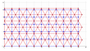 This result can be shown in two more ways. First, we can see that the distance between two rows of the triangular pattern is not 2 meters, but only about 1.7 – the exact value is the square root of 3, the height of the equilateral triangle. Then, we can figure out the area occupied by each person. If you remember the neighbors’ count we just did we can see that 9 blue dots (that is 1 person and its 8 closest neighbors) occupy a square with a side of 4 meters, an area of 16 m2. That’s a little less than 1.8 m2 for each person. Now, in the triangular pattern, 7 red dots form a regular hexagon with a side of 2 meters. Knowing that the area of such a shape is about 10.4 m2 we get only 1.5 m2 per person. Yes, red dots will have less personal space to move their arms around but they will all remain at the required safe distance. This confirms the superiority of the triangular pattern and should be kept in mind when we will need to fit as many students as possible inside a classroom.
That’s it for today. I hope these answers were satisfactory and not too technical. I want to thank everyone who had a question and apologize for those I couldn’t cover here.
Featured image credit: Shutterstock
About the Author :

Originally from Brittany, David Soquet graduated from the Université de Rennes, before becoming a math teacher. After honing his skills at a middle school near Paris, he joined the Lycée Français in 2008. He is the father of two children and is passionate about the history of science. In his teaching, he tries to balance the rigor required by mathematics with humor and discovery. He is very curious and his interests range from modular origami and norse mythology to Fritz Lang’s cinema and music.